Class Chart’s Analytics feature allows you to view an overview of your school’s awarded behaviour points, and how they are broken down into behaviour types and classes.
To access analytical reports for your school, click on the Analytics tab at the top of Class Charts.

You will then be presented with a page with the following layout:
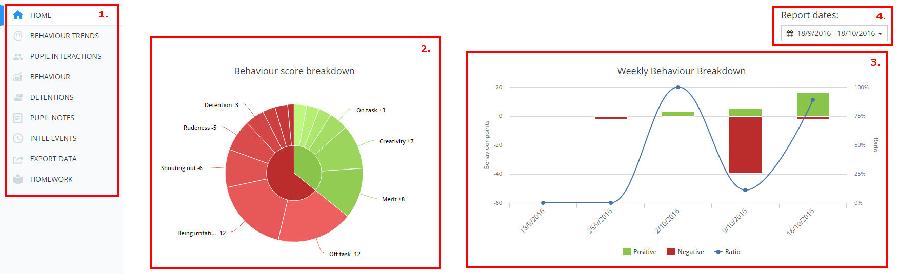
1) This is the tabs menu. You can select any of the tabs to view different analytical data. We will go in depth to each of these in following articles.
2) This is the behaviour score breakdown pie chart. The inner segments indicate the overall number of negatives and positives. The outer segments then indicate the categories those points were awarded in. The data displayed comes from dates determined by the menu on the right hand side of the page (4).
3) The behaviour breakdown bar chart indicates the positive and negative behaviours awarded and also the ratio of positive:negative behaviours. Depending on the dates selected from the menu on the right hand side of the page (4) the graph will either breakdown the data by day, week or month.
4) This is the dates menu. Here you can select what date range of data you want to be shown in the charts.